ZuZu Design System & Brand Identity
ZuZu · Visual Design · Design Systems
Designing the platform where superfans become an artist's most valuable audience.

Define. Systematize. Scale.
EXECUTIVE SUMMARY
Joined ZuZu as the sole visual designer when the product existed only as a strategic thesis: no brand, no UI, no design infrastructure. Over 4.5 months, I built the complete visual identity and design system from zero. The system I delivered is currently in active engineering implementation and powered the interactive prototype used for investor pitches.
ROLE
Sole Visual Designer
TEAM
1 Designer (Me)
Founder & Product Team
TIMELINE
4.5 months
WHAT I DID
- •Built the complete visual identity from zero: logo suite, brand bible, and brand application templates
- •Designed 16+ UI component types with documented states, variants, and interaction specifications
- •Created a custom iconography system, including custom cursor states
- •Architected dark/light theming as a system, not a color swap
- •Powered the interactive prototype used for investor pitches
TOOLS & PLATFORM
Figma, Lovable · Design Systems, Brand Identity, Iconography

Before:
An 11-page strategic thesis and a multi-billion dollar market opportunity identified by Goldman Sachs and Morgan Stanley, but zero visual identity, zero UI, and zero design infrastructure.
After:
A complete brand identity system and 16+ component UI library designed to make a new kind of economic relationship, superfans paying for proximity, identity, and belonging, feel tangible, trustworthy, and worth paying for.
PROBLEM
Superfans, the most economically valuable segment of an artist's audience, have never had a native home.
Why This Matters
FOR ARTISTS
Their most economically valuable audience is invisible to them. They monetize superfans indirectly through concerts and merchandise because those are the only channels available.
FOR FANS
There is no place designed for what they actually want: proximity, identity, and belonging. They piece together a fan identity across five platforms, none of which recognize or reward their commitment.
FOR DESIGN
ZuZu needed a visual language for an entirely new product category, one with no established design patterns to borrow from.
Music is no longer the product. Spotify redefined music as ambient infrastructure, everywhere, available for fractions of a cent per stream. The song gets someone interested in an artist, but it is not what monetizes that interest. Instagram gives superfans a feed. Discord gives them a chat room. Patreon gives them a subscription paywall. None of these platforms were built for the relationship itself.
RESEARCH
Designing for a Relationship No Platform Was Built Around
I audited the visual identity and UI patterns of platforms in the artist-fan ecosystem, explored visual direction through moodboarding, and pressure-tested every decision in weekly design critiques.
Competitive Audit

I analyzed the visual identity and UI patterns of seven platforms in the artist-fan ecosystem to identify where their design languages succeeded and where they failed to communicate a direct, intimate relationship.
Key Insight: Every platform solved an adjacent problem. None were designed for the core relationship ZuZu was building around.
Visual Direction

Through moodboarding and visual exploration, I developed a direction that had to reconcile two opposing aesthetics: the clean efficiency of contemporary product UI with the warmth and personality of early-2000s desktop software. The founder's creative direction was intentional: ZuZu should feel like a personal digital space, not a content consumption feed.
Validation
Weekly design critiques with the founder and team served as the primary feedback loop throughout the engagement. Brand decisions, component designs, and system architecture were pressure-tested against the product thesis every week, ensuring the visual system stayed aligned with what ZuZu was actually building, not just what looked good in isolation.
HOW MIGHT WE
How might we create a visual identity and design system that makes an entirely new kind of platform, one built for superfan belonging, not content consumption, feel immediately credible, emotionally resonant, and scalable enough to grow with the product?
DESIGN
The Design Brief
The founder's creative direction posed an intentional paradox: build an interface that carries the warmth and personality of early-2000s desktop software, the era of Winamp skins and AIM profiles, when digital spaces felt personal, but with the functional clarity and scalability of modern product UI.
This wasn't aesthetic nostalgia for its own sake. ZuZu's thesis is that fan-artist relationships should feel intimate and identity-driven, not transactional. The visual system needed to evoke that feeling of personal digital space while remaining intuitive enough for a modern product audience.
Finding the Middle Ground
Through extensive iteration, exploring gradients, type treatments, button styles, and interaction patterns across the full stylistic spectrum, I converged on a system that leans modern in structure and minimalist in layout, but carries nostalgic DNA in its personality: color choices, iconography, and moments of visual texture.
Guiding Principle: Function sets the floor, feeling sets the ceiling. Every component had to be immediately legible to a first-time user. Once usability was locked, I pushed expressiveness as far as it could go without compromising comprehension.
Design Principles
Belonging over Consumption
Every decision was filtered through one question: does this make the user feel like they belong to something, or like they're consuming something? The visual language had to signal community, not content.
Personality within Structure
Modern UI frameworks provide clarity. Early-2000s interfaces provided soul. The system borrows structural discipline from the former and emotional resonance from the latter, never sacrificing one for the other.
Scalable Specificity
Every component serves ZuZu's specific product thesis while remaining extensible enough to support features that don't exist yet. A foundation, not a ceiling.
Brand Identity

Logo Suite
From initial exploration through multiple development rounds to a final logo and monogram variant, designed to work across product UI, social media, investor materials, and eventual merchandise.
Brand Bible
Foundational guidelines codifying the visual language, ensuring that every touchpoint, whether designed by me or by someone after me, maintains the system's integrity.
Dark & Light Mode
Built as a system-level architecture, not a color swap. Both modes preserve the brand's nostalgic personality and hierarchy regardless of user preference or system setting.
UI Component Library
16 component types, each designed with documented states, variants, and interaction specifications.

Core Interaction
Buttons
Primary, secondary, outline, and pill variants with disabled states and leading/trailing icon configurations. Interaction clarity over aesthetic maximalism.
Input Fields
Three distinct variants (standard text, rich text editor, date/time picker), each solving a different input context rather than forcing visual uniformity.
Controls
Sliders, steppers, and interactive elements for direct manipulation.
System Feedback
Alerts
Banners, dialogues, and toast notifications calibrated for appropriate urgency without disrupting the platform's warmth.
Loaders
Spinners, progress bars, and skeletal loading states that maintain brand personality during wait states.
Ratings
Review and star-rating components for fan-to-fan and fan-to-artist interaction.
Data & Media
Charts
Data visualization for artist dashboards: analytics and engagement metrics designed for creators, not analysts.
Tables
Structured data display for revenue, fan activity, and content management.
Media Players
Audio and video playback controls designed for a music-native context, not retrofitted from a generic player.
Fan Experience
Fan Reaction UI
The most expressive component in the system. A polling interface with percentage breakdowns where fans directly influence artist decisions. This is where nostalgic, personality-driven design could push furthest, because engagement and emotional investment are the point.
Settings
Toggle switches, checkboxes, and notification badges with unread counts. The layer where fans control their relationship preferences.
System Infrastructure
Icon Buttons
Interactive buttons relying on iconography without text labels.
Icons
Complete custom iconography suite designed for the platform's specific interaction patterns.
Cursors
Custom cursor states (default, hover, pointer) reinforcing the early-2000s personality at the interaction level.
Iconography

A complete custom icon suite designed specifically for ZuZu's interaction patterns, not pulled from a generic icon library. Each icon carries the system's visual personality while maintaining the legibility standards required for UI-scale rendering.
Brand Application

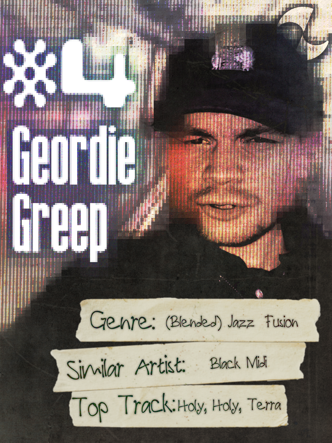
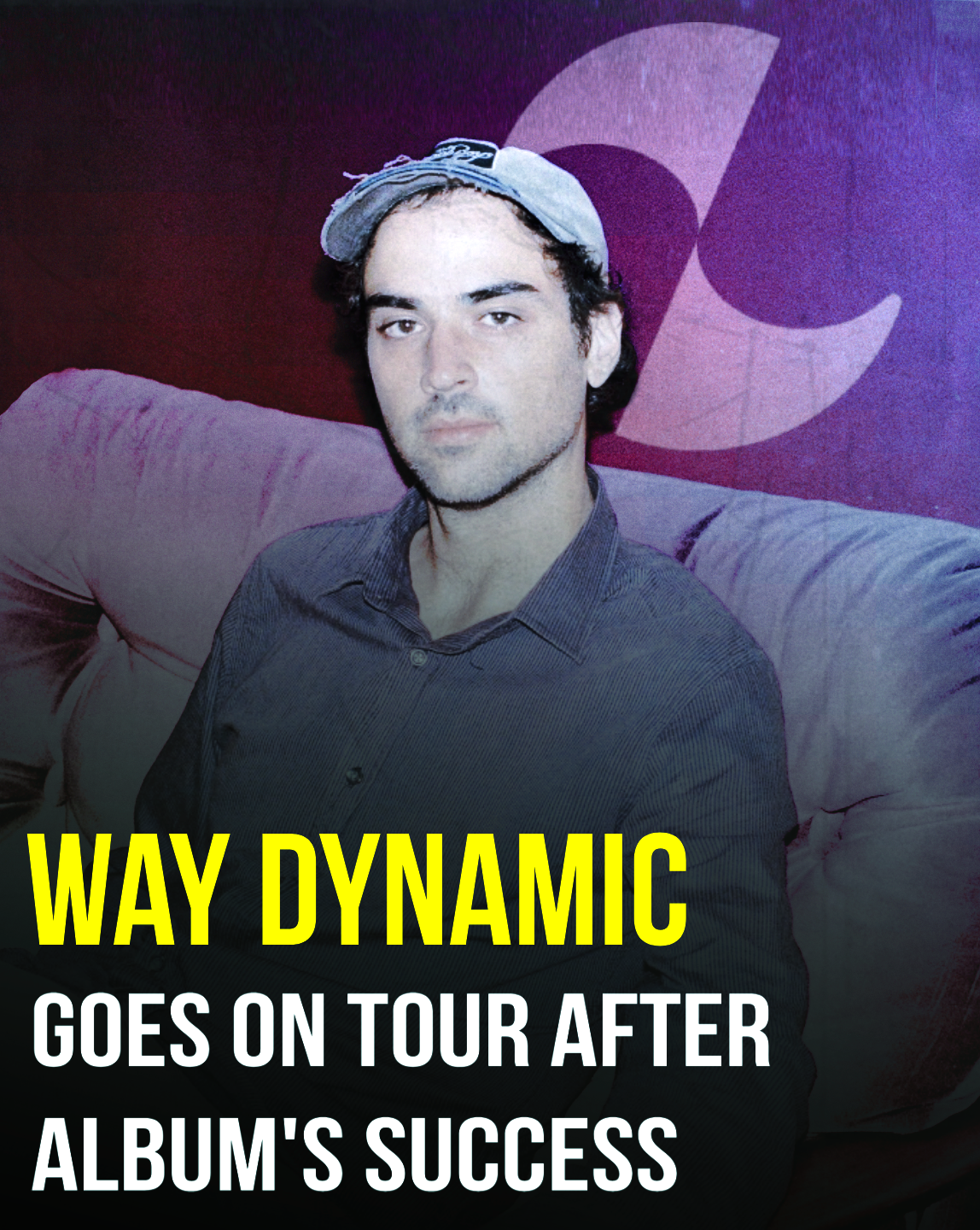
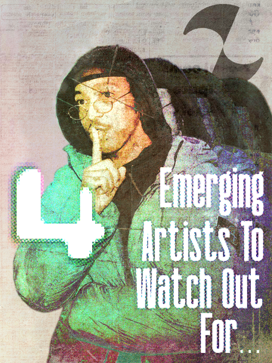
Social media templates demonstrating how the brand identity system extends beyond the product UI to marketing and community-facing touchpoints, ensuring visual coherence everywhere a potential superfan might encounter ZuZu.
Social Media Presence
A strong social media presence was core to the brand strategy. ZuZu lives or dies on superfans discovering artists, so the brand needed a distinct visual style: when someone sees a graphic or promotional post for ZuZu and its artists, they should recognize the brand immediately, without reading a word. The nostalgic, personality-driven visual language from the design system carries directly into every social touchpoint.
OUTCOME & INFLUENCE
In Production
The design system is currently in active engineering implementation, components are being built from the specifications I delivered. The brand identity and component library powered an interactive Lovable prototype used by the founding team for investor pitches.
By the Numbers
16
UI component types with documented states, variants, and interaction specs
26+
Total deliverables across brand identity, design system, and brand application
3
Complete system documents (brand bible, component library, iconography suite)
2
Theming modes (dark/light) built as system architecture
4.5
Months from zero visual identity to engineering-ready design system
1
Designer. Every visual decision, from logo to cursor states, was mine.
Retention
At the end of the engagement, the founding team invited me to continue contributing as visual design needs arise. The system I built became the foundation they're scaling on.
ENDORSEMENTS
Founder validation of creative vision and work product.
“Your creativity and aesthetic vision were so crucial in building ZuZu's visual identity.”— Rand, Founder, ZuZu
“Thank you so much for your hard work and excellent work product.”— Yorgos Papadopoulos, ZuZu
LESSONS LEARNED
- •Function sets the floor, feeling sets the ceiling. Every component had to be immediately legible to a first-time user; only once usability was locked did I push expressiveness as far as it could go.
- •Designing for a product category that didn't exist yet means borrowing no patterns. The system had to establish its own visual language from scratch.
- •Weekly critiques against the product thesis kept brand decisions grounded in what ZuZu was actually building, not just what looked good in isolation.
- •A design system should be a foundation, not a ceiling. Building for extensibility from day one meant the system could scale with features that didn't exist yet.